Usability Heuristics for LA Fitness App
INTRODUCTION
Role: UI Designer | Duration: 3 days | Type: Personal Project
As a personal project, I decided to review LA Fitness's app based on usability. I was inspired to do this because of my own experience while using the app for the first time. While using the app more closely and frequently I discovered felt there were elements that could be improved. I evaluated the app using Jakob Nielsen's usability heuristics.
Jakob Nielsen provides 10 general principles for interaction design. These heuristics are broad rules and not specific usability guidelines; however they can provide insight on where to improve UI design.
- Visibility of system status
- Match between system and the real world
- User control and freedom
- Consistency and standards
- Error prevention
- Recognition rather than recall
- Flexibility and efficiency of use
- Aesthetic and minimalist design
- Help users recognize, diagnose, and recover from errors
- Help and documentation
About LA Fitness and the App
LA Fitness is a North American gym company founded in California. In 2010, La Fitness launched their first app available on Google Play and the App Store. Their list of features includes:
- Check-in to the club using the Mobile Membership Card option
- Find Clubs and Classes
- Create quick access to your Favorite Clubs, Classes, and Instructors
- Book Personal Training sessions
- Reserve Racquetball/Squash courts
- Review your Check-in History
EVALUATION CRITERIA

PASS
0 errors based on the heuristic

SATISFACTORY
1-2 errors based on the heuristic

FAIL
3 or more errors based on the heuristic
1. VISIBILITY OF SYSTEM STATUS
The design should always keep users informed about what is going on, through appropriate feedback within a reasonable amount of time.
- Jakob Nielsen
 FAIL
FAIL
Search results for "Find class by type" and "Find class by location". For find class by type, once a valid zip code is entered the interface does not change to let the user know that items have been filtered. Entering a postal code prompts an error but the user is not told how to fix that error.
For the "find class by location" feature, entering any type of data does not return anything to the user and no signal that the search was validated.
This search error is consistent throughout the app.
2. Match between system and the real world
The design should speak the users' language. Use words, phrases, and concepts familiar to the user, rather than internal jargon.
Follow real-world conventions, making information appear in a natural and logical order.
- Jakob Nielsen
 SATISFACTORY
Jakob's law states that "Users prefer your site to work the same way as all the other sites they already know."
The LA Fitness app's menu display on the home page is unique. When looking at other fitness and social media apps; users tend to be present with a fixed tab at the bottom of the page as a "menu".
The hamburger icon is not needed in this app. The majority of the content under this tab are the same links found on the home page. This is disjointed from other applications such as LinkedIn, where a hamburger tab would contain rarely used information.
3. User control and freedom
Users often perform actions by mistake. They need a clearly marked "emergency exit" to leave the unwanted action without having to
go through an extended process.
- Jakob Nielsen
 PASS
PASS
I gave this pass because there are some features within the app that can be customized to user's liking. The app has a feature to open the app when ever the user is close to an LA Fitness gym for more efficient check-in. The user can also select favourite gym locations and instructors which can simplify reserving courts and choosing fitness classes. There is always a clearly marked back button in the top left corner for the pages for the user to exit or undo any actions within the app.
4. Consistency and standards
Users should not have to wonder whether different words, situations, or actions mean the same thing. Follow platform and industry conventions.
- Jakob Nielsen
 FAIL
FAIL
Iconography within the app do not have similar look and feel. Line thickness is noticeably different when comparing icons. This makes the page design disjointed.
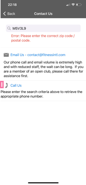
There are alignment issues on the app. For example on the "Contact us" page the padding on the "Call us" section does not match the padding on the rest of the page.
There is an inconsistent presentation of errors. Error text is presented in three different ways. 1. With red text either below the field 2. With red text above the type in field or 3. With a popup.
5. Error prevention
Either eliminate error-prone conditions, or check for them and present users with a confirmation option before they commit to the action.
- Jakob Nielsen
 FAIL
FAIL
VIP guest pass does not have a confirm information page/ pop up before submitting. If the user makes mistake such as adding the wrong phone number; the user cannot edit information after it is submitted. They also cannot delete the pass after submission.
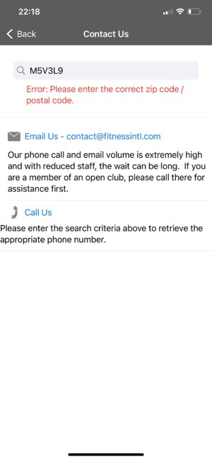
Contact us page. Search feature within the contact us page does not capture postal codes. It sends an error regardless of whether the postal code is correct or not. This error does not appear for zip codes.
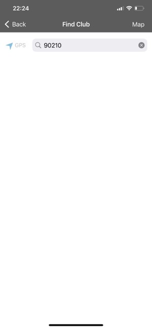
Find club feature does not show results for any submitted postal codes or zip code; despite hint text in the search bar saying to search with those methods.
6. Recognition rather than recall
Minimize the user's memory load by making elements, actions, and options visible. The user should not have to
remember information from one part of the interface to another.
- Jakob Nielsen
 SATISFACTORY
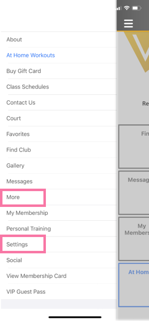
Within the app there are two places that lead to two different subpages called "Settings". This can create confusion for the user. The user will need to recall that “More” page leads to a page titled "Settings". They may recall the subpage name and click "Settings" which would not lead them to their expected page.
7. Flexibility and efficiency of use
Shortcuts may speed up the interaction for the expert user so that the design can cater to both
inexperienced and experienced users. Allow users to tailor frequent actions.
- Jakob Nielsen
 SATISFACTORY
Upon first login the user is presented with an overwhelming amount of info on the home page. The home page doesn't display information in a clear and concise way.
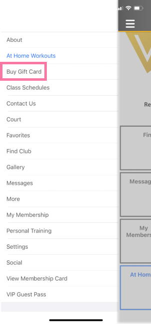
The pages under the hamburger menu are organized alphabetically rather than frequency of use. For example, the "Buy Gift Card" page would be use infrequently buy the user. However, this page appears near the top of the page list.
8. Aesthetic and minimalist design
Interfaces should not contain information that is irrelevant or rarely needed. Every extra unit of information in an interface competes with the
relevant units of information and diminishes their relative visibility.
- Jakob Nielsen
 FAIL
FAIL
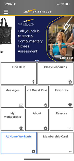
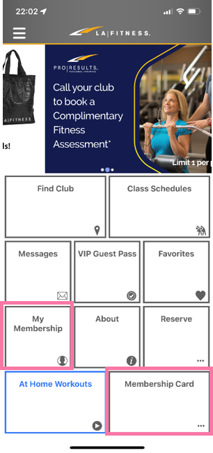
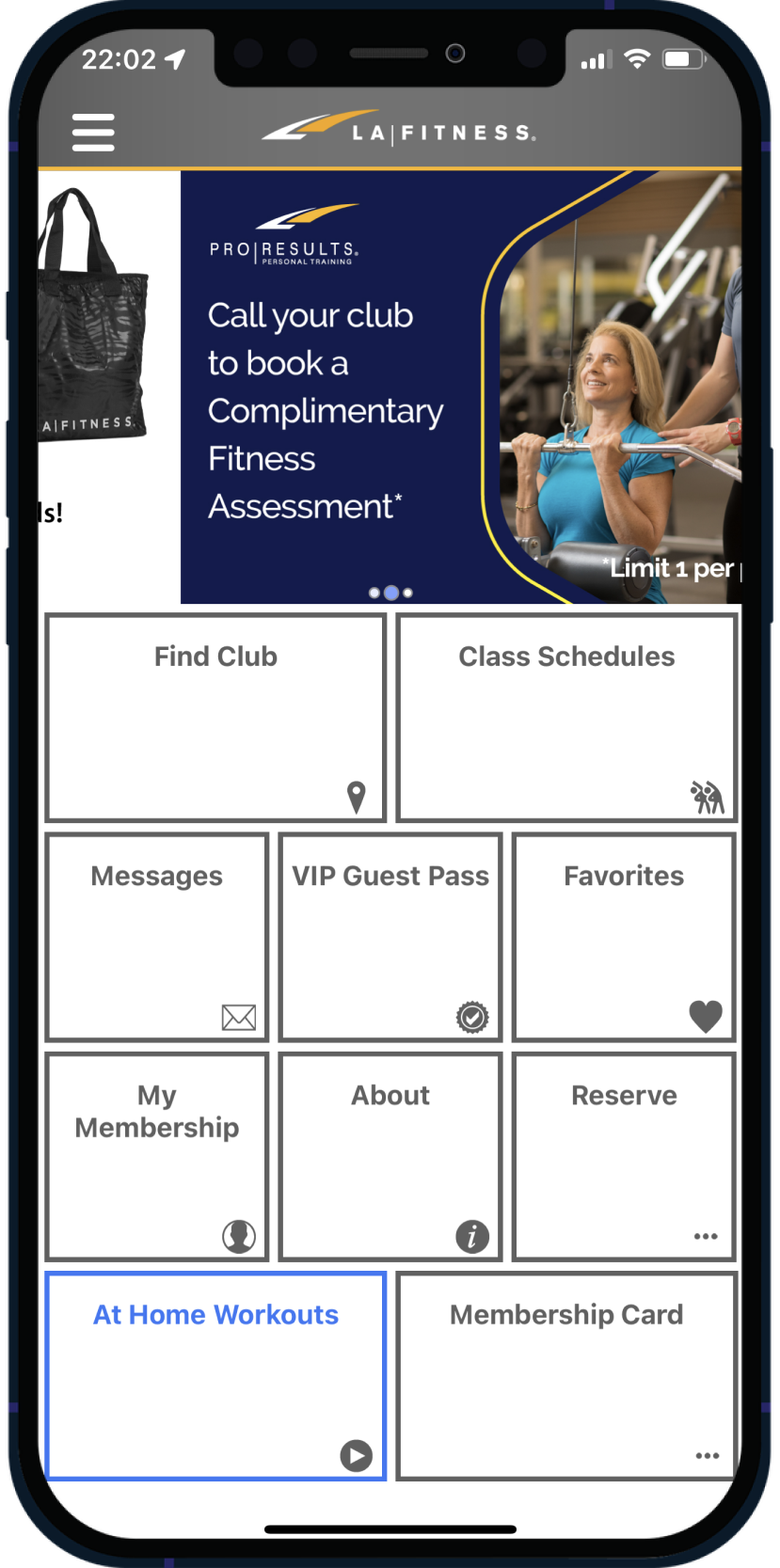
The home page is cluttered with the box layout. Each box covers a large amount of space and is not an efficient way to present the menu information.
Iconography within the boxes does not add clarification to the text within the boxes. For example, the meatball icon does not provide clarity to the "Reserve" or "Membership Card" menu.
Gallery at the top of the page can be considered as "noise". Takes up one third of the page. Frequent users of the app will likely not interact with that element as it shows promotions for new customers only.
9. Help users recognize, diagnose, and recover from errors
Error messages should be expressed in plain language (no error codes), precisely indicate the problem, and constructively suggest
a solution.
- Jakob Nielsen
 SATISFACTORY
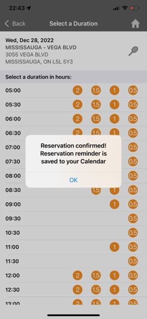
For adding a VIP guest pass, there is an error message for empty fields. However, there is no review before submitting the pass and no way to remove the guest pass once it is submitted. However for reserving a court, the user is prompted to review the time and date. At the end of the flow the user receives an email and is informed that the reservation was added to their calendar. If user made a mistake, they have the ability to cancel the reservation in app and are notified again via email that the reservation was canceled and that the reservation is removed for their calendar.
10. Help and documentation
It's best if the system doesn't need any additional explanation. However, it may be necessary to provide documentation to help users understand how
to complete their tasks.
- Jakob Nielsen
 SATISFACTORY
Lack of tooltips and descriptions reduces predictability in the platform. The menu on the home page is one example of this. For example, the “My Membership” versus the “Membership Card” menu item. Both names are similar enough that the user could select one by mistake. Secondary text underneath the title would provide clarity about what to expect when this item is selected such as "View membership QR Code" or "View membership history".
Evaluation

PASS
- User control and freedom

SATISFACTORY
- Match between system and the real world
- Recognition rather than recall
- Flexibility and efficiency of use
- Help users recognize, diagnose, and recover from errors
- Help and documentation

FAIL
- Visibility of system status
- Consistency and standards
- Error prevention
- Aesthetic and minimalist design
