Creating a help center
Introduction
Role: UX Designer | Duration: 20 days | Type: Work Project | Tools used: Sketch, InVision
During my time at Home Trust, I designed their first ever website help center for their brand Oaken. I collaborated with the business team, call center the development team as well as other designers in my team. My prototype was created using Sketch and InVision.
About Oaken
Oaken Financial was launched in 2013 to offer Canadians a competitive alternative to manage and control their savings independently. Oaken offers several low risk savings accounts such as Guaranteed Investment Certificates (GIC), Tax Free Savings Account (TFSA) and Savings Accounts.
Problem Statement
Oaken call center experiences an overwhelming amount of calls. There was a concern from business that the calls would surge after the launch of the new digital banking platform.
The ask from business was to create a net new help center on the website for customers to find answers and step-by-step tutorials about digital banking.
Copy planning
Talking to the business team
I set up a meeting with the VP Digital Marketing and Customer Engagement to understand the copy requirements she would need to see in the Help Center. From that meeting I gathered that there needs to be separation from digital banking and Oaken as a brand. I also learned about an existing FAQ page on the Oaken website. The FAQs were several years outdated and did not include questions about the new digital banking platform.
Talking to the call center
I reached out to representatives from the call center to gain some insight about what types of questions customers are asking. I learned that common questions depends on the time of year. For example, in the first quarter of the year questions tended to be more tax related. Higher calls about opening an account would occur when Oaken had savings account rate increase. The call center was not available on weekends, this would lead to an increase in calls on Monday mornings.
Reviewing Digital Banking
To create the step by step guide, I viewed and interacted with each page on the digital banking site through browser, Android app and iOS app. I documented my steps in an excel divided into tabs categorized by feature. I created potential questions users may have for each feature and provided a step-by-step answer in separate columns. I opted to use a live excel sheet for easier hand-off to business to add comments and make edits.
Viewing our competitor's Help centers
I gathered screenshots and screen recordings of other Canadian bank help centers and took note of which features they are using.
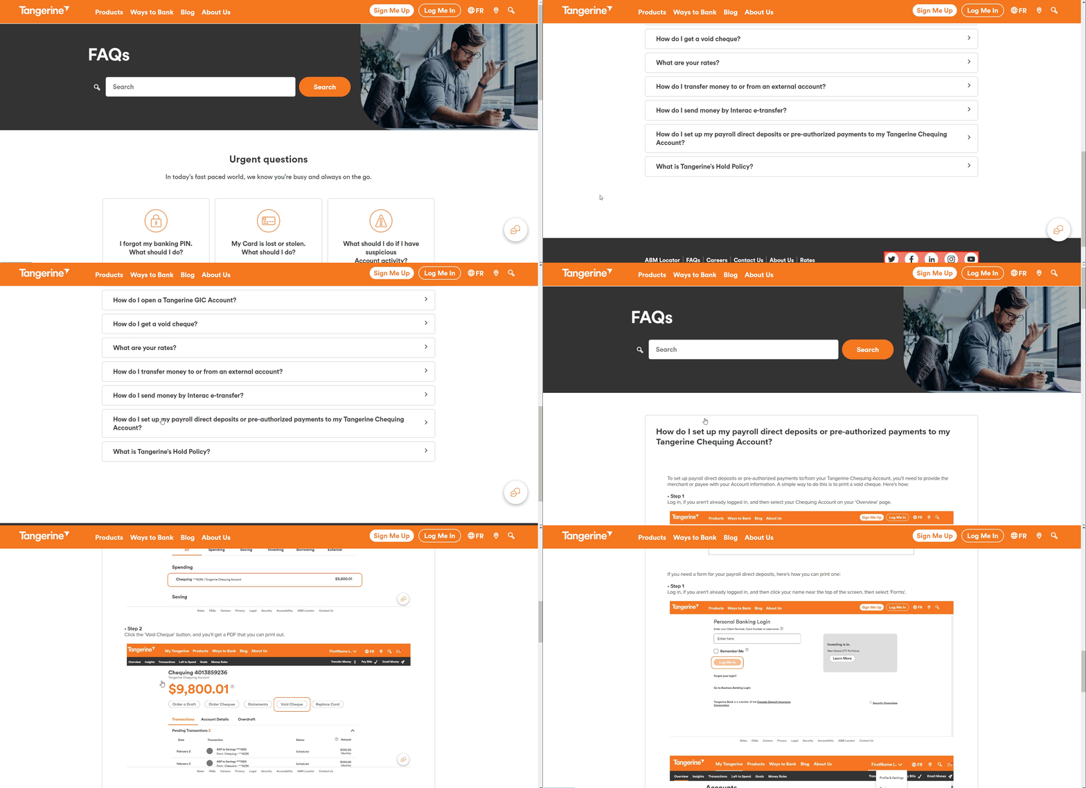
Tangerine
- Search bar at the tp of the page.
- Section for "urgent questions" below to the search bar. Quesions here are about account security.
- Section for "top questions".
- Answers to questions are opened on a new page.
- Link to chat floating at the bottom right side of the page if more assistance is needed.
- Section to respond if the information was helpful.
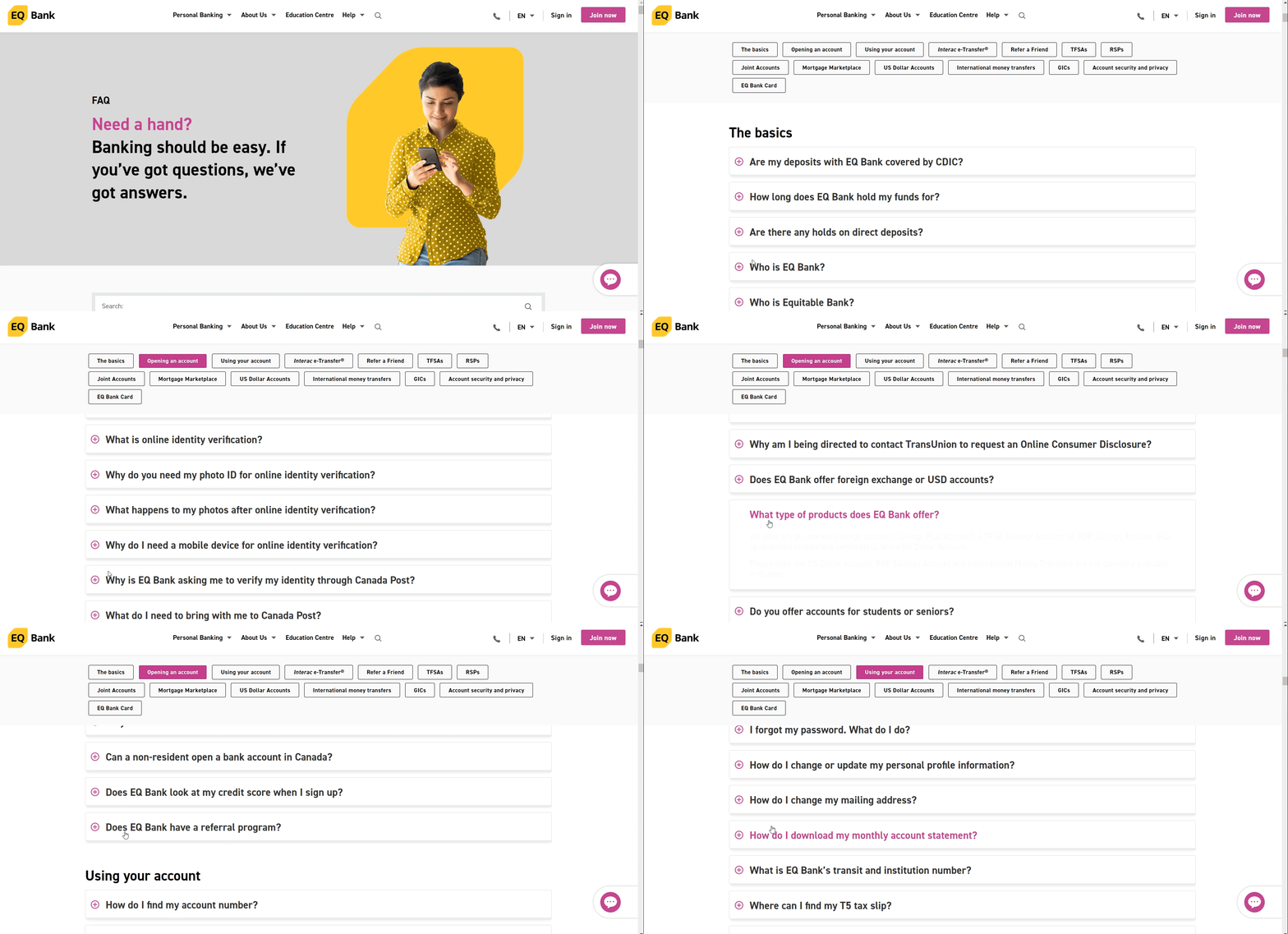
EQ Bank
- Questions are divided in sections.
- Accordion style questions and answers.
- Search bar at the top of the page.
- All questions and answers are on one page.
- Sections for the questions stay fixed at the top of the page as the page scrolls
- Links to online chat and email is further assistance is needed.
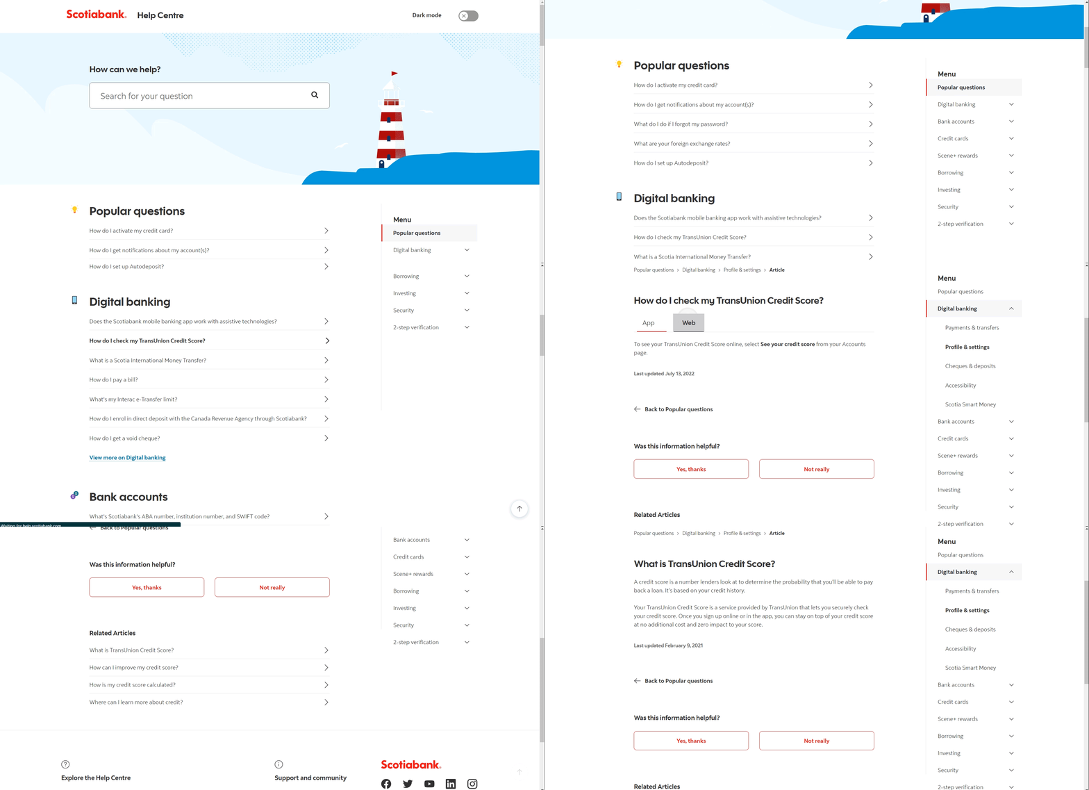
Scotiabank
- Search bar is at the top of the page.
- Section for top five most popular questions; followed by top for questions for each category of their help center. Each category has a link to find more questions about that topic in a new page.
- Left panel for each question category.
- Answers to questions have a response for web and app.
- Section to respond if the information was helpful.
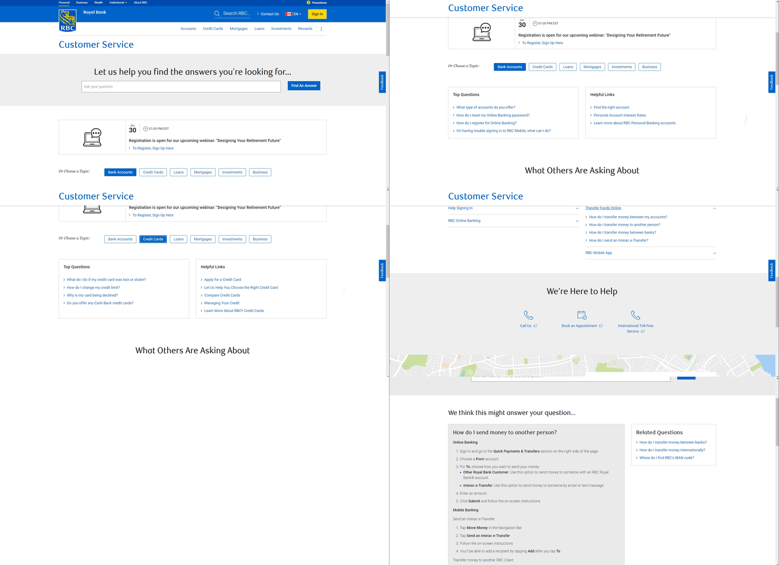
RBC
- Search bar is at the top of the page.
- Link to a finance related webinar.
- Questions are divided into sections. Each section has most popular questions and helpful links to tools such as mortgage calculator.
- Answers to questions are opened in a new tab.
- Links to phone number and booking an appointment if more assistance is needed.
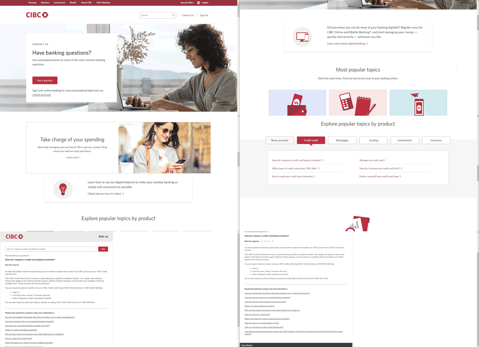
CIBC
- Search bar is at the top of the page.
- Features "most popular" topics at the top of the page with links to questions.
- Questions are divided by specific products.
- Answers to questions are opened in a new tab. Question search bar is also available on the page.
- Section for "How-to" videos.
- Link to customer support email if further assistance is needed.
- Links to how to find a physical store.
Considering Development contraints
Prior to this project, I attended a three hour development session about a new content management system the Oaken website would be using. During this session I learned about pre-developed widgets that are already in the website content management system. Knowing this, I made sure that the help center design would not deviate from the design widgets and functionality that already exists on the website.
Considering our customers
Here are some of the customer data and behaviours I condsidered while designing the help center.
Over 50% of our customers are senior citizens
With the overwhelming majority of our customers being seniors; I thought it would be best to incorporate design practices that are specific to an older demographic.
Our customers are not comfortable with technology
This consideration came up from my gathered research from the contact center. Most calls received from the contact agents about onine banking are related to computer literacy rather than our products and services. Examples of questions asked are, "How do I add a special character to my password?" or "Where can I find my junk email?". This behaviour touches on not only the design but also the questions and answers within the help center. Copy and the design must be simple to limit confusion for our customers.
Percentage of Customers in each Age Group

Information Architecture
Categorizing the questions
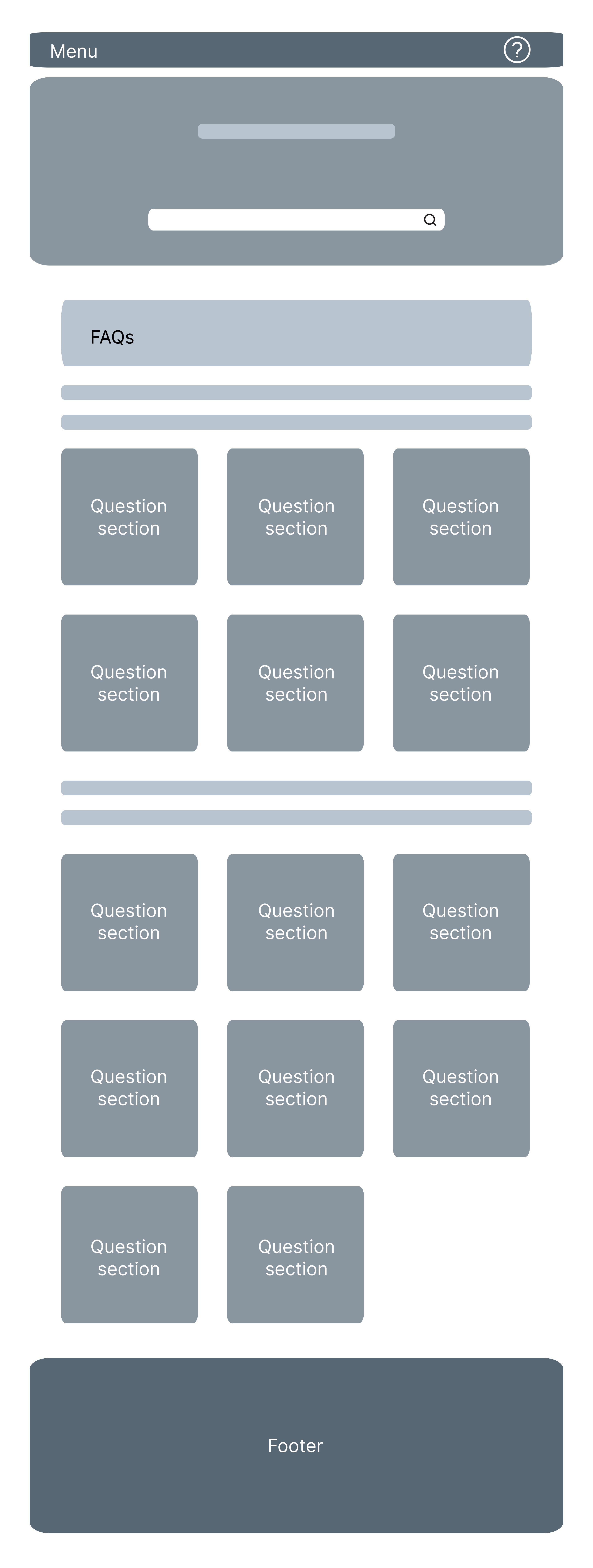
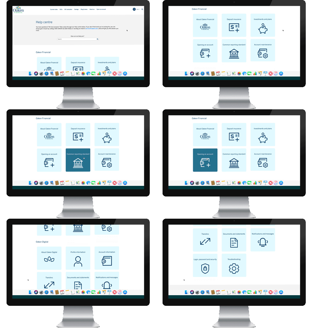
i designed help center divided into two large sections. The Oaken Finanical section would feature six smaller sections about the Oaken brand and general inquiries. The smaller sections for Oaken Financial were already determined by out legacy FAQ page on the website. However, I did review the questions and answers and revised them with up to date content. The Oaken Digital section would feature eight smaller sections about the digital platform such as steps on how to complete a task on Oaken Digital. These smaller sections were taken from our digital banking platform menu. This was the best way to categorize the questions, because of familiarity for the user. When considering the usability heuristic of "Efficiency of Use", using the same terminology in the help center would reduce the amount of time for the user to find the answers to their questions. I also added an addtional section called "Troubleshooting" for anticipated questions about device compatibility.

Low Fidelity Design
My early version of the help center included features such as:
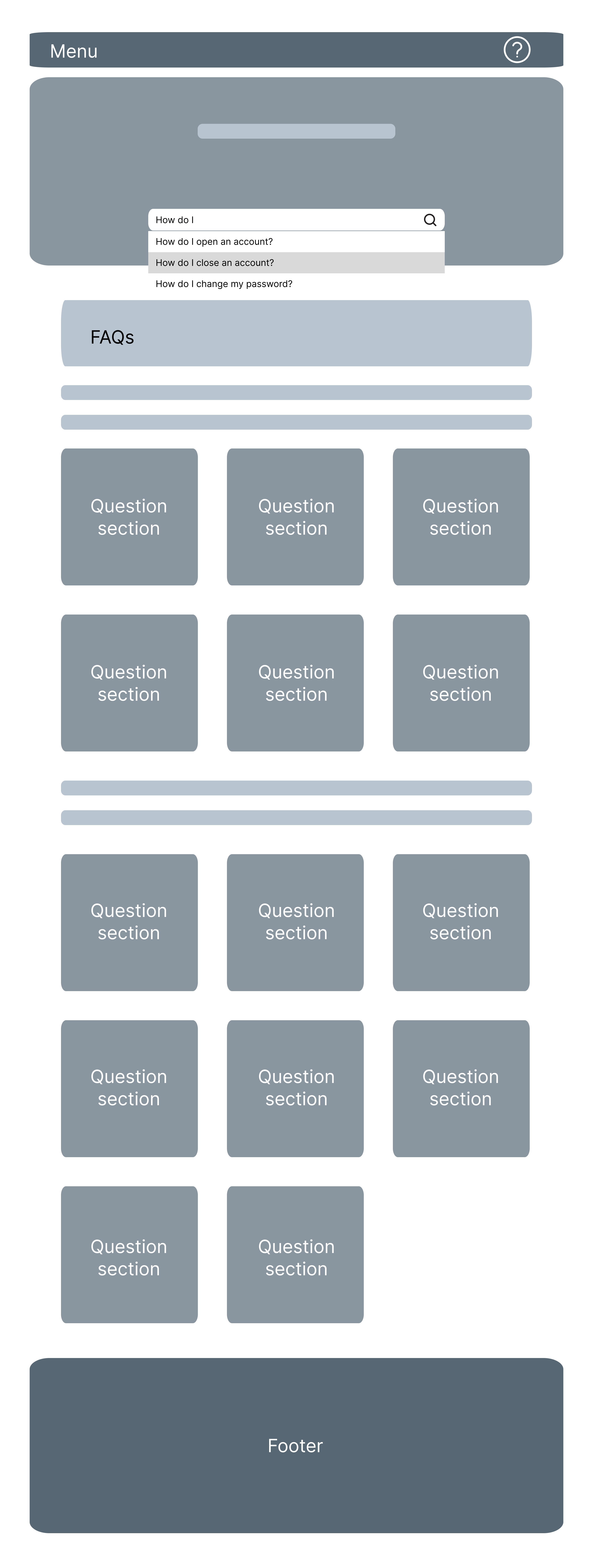
- Search bar that will automatically suggest questions as the user types.
- Frequently asked questions based on the most common questions asked in the call center on the homepage.
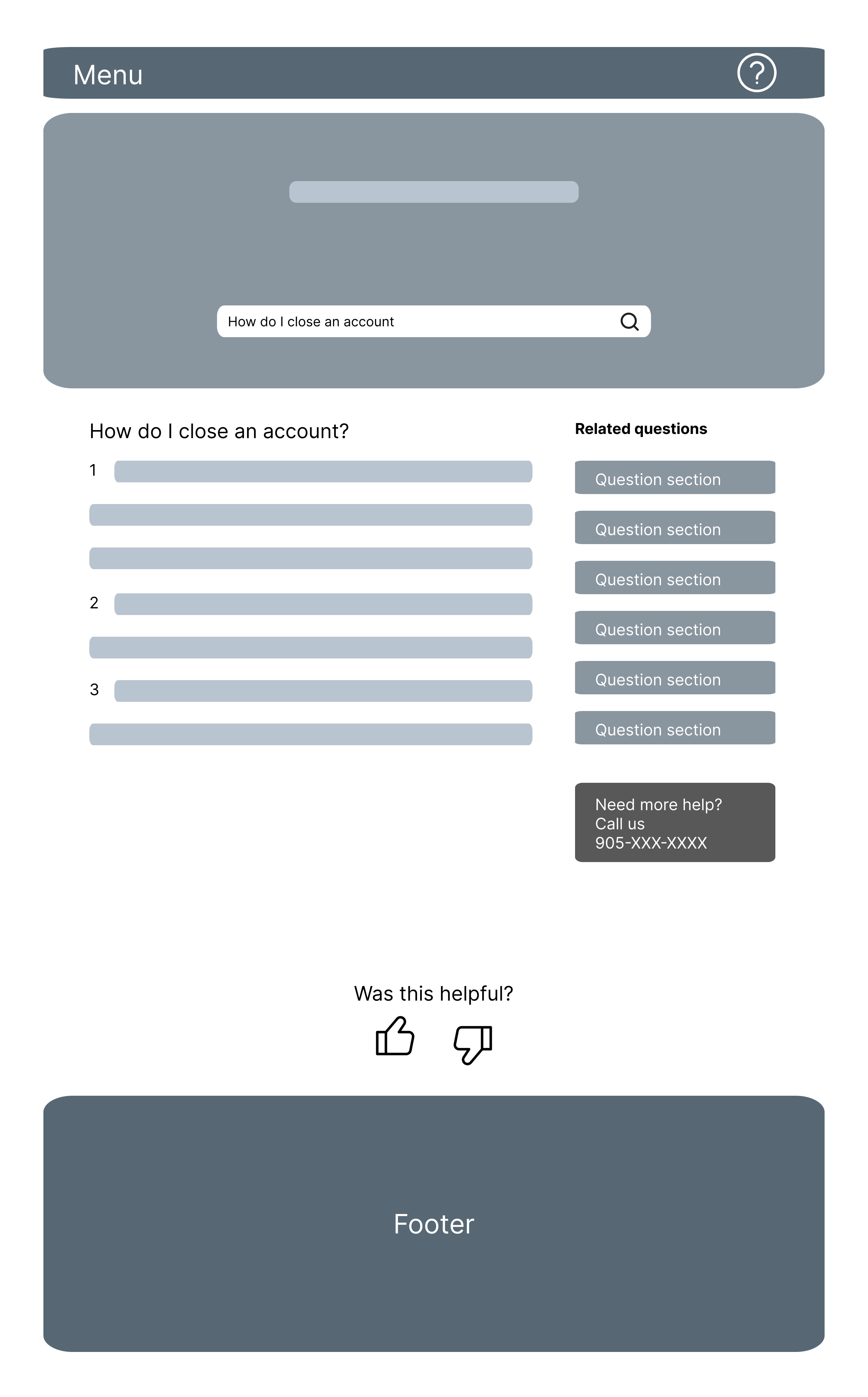
- Related questions left side of the page to other sections in the help center. Information to contact the call center.
- Six sections for questions related to Oaken as a brand and eight sections related to digital banking.
- A condensed version of the homepage for mobile phone viewports to show the top four sections of each section.
- A "Was this helpful?" section at the bottom of the page where to select yes or no for the answer to the question
- A single page for each answer to a question
Issues with early designs
Separate questions for authenticated users
In the early stages of design, the business team mentioned that they would want tailored questions for customers and non-customers. The plan was to determine who is a customer after they log into our website. This created two problems. The first issue is that the help center would need more time with the development team to create. At the time, we did not have enough staff to code different versions of the help center. The second issue is that we did not have enough data about differences between customers and non-customers to show them different questions. We had some educated guesses about what each group would be interested in searching; however, given our issue with staffing we could not justify the amount of work needed for something that might not be that useful for our audiences. We decided to only have one version of our help center.
Search bar functionality
I designed the search bar for the help center to allow the user to search anything they wanted. Once the user entered their search they would be shown results from the help center. This posed an issue where the results could be "overpopulated" with results that the user may not find helpful. For example, a search with just the word bank would return all questions and answers that contain that word which could be several items long. To fix this issue, the development team suggested that we auto suggest results based on what the user types in the search bar; then the user would need to select the question by clicking it to show the answer.
FAQs for each help center category
I designed the help center to have frequently asked questions and answers for each category. However, the business team requested that this be removed. This was because each section had no more than 15-20 questions and they were not certain that the questions would be frequently asked. Business wanted to backlog this feature once we have more insights about what people are searching in the help center.
Condensed mobile view
My intention for this design was to maximize screen length with only the most searched sections in the help center. After discussing with the rest of the design team and business team I opted to show all sections of the help center in mobile view. The main reason for this change, was to reduce the number of clicks for the user to get to the answer of their question.
More changes to the design
My design went through several alterations before the business and development team were in agreement. Some of these changes included:
- Removing the related questions for the help center. Instead a section called "Quick links" was added to have links to each category of the help center.
- Breadcrumbs for the page were moved inside the header to match the existing UI on the website.
- Related questions left side of the page was changed to "Quick links"; where the user can click to go to other help center sections.
- The "Was this helpful?" section at the bottom of the page was removed.
- Each section of the help center would have their own set of questions on a new page. Answers to the questions would be revealed after clicking on the accordion.
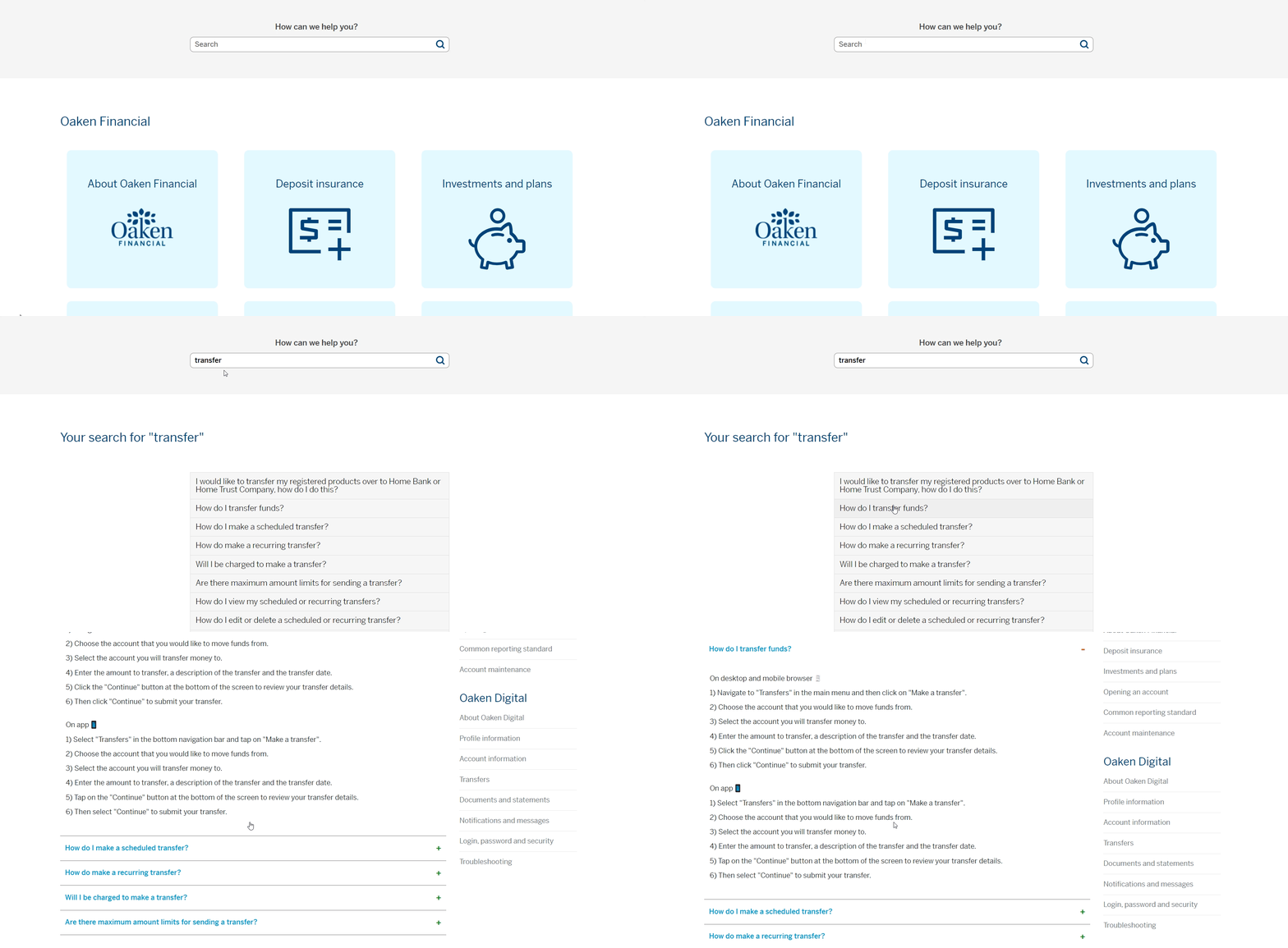
Completed Help Center
The help center was finally put into production months after the inital ask from business to design the webpage. This was due to limited time from the develpment team. Once the help center was put in production, Oaken finally had a tangible place to direct customer queries and concerns.
The Oaken Help center is live. It can be found here.

Did the help center address the problem?
The goal of creating this help center was to reduce calls made to the contact center. However, after the launch of the help center we did not see any changes to the reduction of calls. Below are my reasons why outcome occurred.
The help center was hidden
I planned for the help center to be accessible as a top level link within the menu bar. However, the product owner opted to push this item to a secondary level under the "About us" page. This decision made the help center hidden from our customers who were not aware that we had one.
Customers were not aware of the help center
Similar to point one, our customers we not made aware that we had an online help center. None of the copy on other pages of the website mentioned our new online help center or encouraged them to find answers online.
Our customers are familiar with calling for help
Our senior customer base values human customer service. In situations where they do need help completing a task with Oaken customers stated that they prefer to call rather than search for answers online. Our customers would need to change their current habits for lead to greater usage of the help center rather than the call center.
Conclusion + IMPROVING THE HELP CENTER IN THE FUTURE
To improve the help center in the future, I proposed adding Hotjar to the search bar. Hotjar is a product experience insights tool that gives you behavior analytics and feedback data through tools like heatmaps and session recordings. This would help us to eventually create the FAQ section of the help center as well as improve design based on observational research.
Along with observation research, we wil also have more feedback from the call center to determine whether we should revise existing questions.
